Second, the color of commodity packaging should be consistent with the characteristics of product performance
The color of the packaging and decoration of goods is generally the image reflection of the content, characteristics and usage of the goods. In the process of shopping, we first notice the colors of our customers. The colors of beauty not only physical but also psychologically have beautification and decorative effects. It can make people excited and have feelings, thus attracting customers. Commodities are all-inclusive, some products are available to anyone, and some are used by a specific group of people or specific industries. Therefore, commodities have different performance and characteristics. Their commodity packaging should also be based on the performance and characteristics of different commodities. Use different colors.
Food generally uses bright, bright and coordinated colors to indicate that food is delicious and fresh. Confectionery biscuits are usually based on warm colors, red and yellow (milk), and gold are more, while red is dominant. Even if the colors are to be reconciled, it requires clear, strong, bright and easy levels. In addition to moving the image, it must be colorful, showing the color, smell, and taste of food, and it can even cause people's appetite.
In addition to the beautiful design of the bottle design, the wine bottle design also shows the taste of the alcohol and the rich aroma characteristics. Beer is a cool drink, suitable for cool colors, pure colors, and refreshing, giving a cool feeling. The complementary color of wine requires a strong, deep, giving a nourishing feeling.
Daily hardware (knives, scissors, etc.) should be thick, simple, and reconcile to reflect the firmness of the product's internal structure.
Drug packaging often uses blue, green, and other cool colors, making people feel comfortable.
Cosmetics are generally used by women. Therefore, they often use reconcile, elegant and light colors (such as pink and flesh) to give people a delicate, delicate and smooth feeling.
Toys and stationery have more lively contrasting colors and lively pictures to suit children's strong and innocent psychological features.
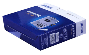
Electronic products often use blue as their dominant color in order to reflect their high-tech properties. Figure 2
Many of the original products had a bright, attractive color that made them an attractive hue. We should cherish this "inherent hue" and try to make full use of this "inherent hue" in the packaging of the packaging style, design, text arrangement and the selection of packaging materials. In this way, packaging can often achieve good results. For example, the design of products such as fresh orange juice, orange juice, green plum wine, and coffee. See Figure 3.
Of course, the above explanation refers to the general rule. If the colors are applied successfully, it is also possible to break through the general rules of using color, and sometimes even obtain special effects.
(to be continued)
Sidelight Curtains,Patio Door Curtains,Curtains For Closet Doors,Sorghum Leaf Door Curtains
Shandong Guyi Crafts Co.,Ltd , https://www.guyicraftscn.com