Designers from the analysis of the different signs used by old Coca-Cola - water droplets, colors, fonts, round signs and bottle shape found, in addition to the bottle, those signs have the same brightness, no part can be highlighted. The result of the survey is that customers are more interested in some of these things. In particular, it is worth mentioning that the outline of the bottle can effectively evoke nostalgic feelings, causing people to refresh their feelings, and the ability to identify them.
Coca-Cola's red and its lettering are effective entry points for its brand. However, the outline of the bottle is just like Nike's fold. It surpasses its will and becomes a symbol. Designers found that the word "always" contains the same emotional factors as the round seal.
By re-emphasizing these elements of the new brand image and the drop of water, designers incorporated the emotional value of the element into a new, relevant way. They added the words “always†(delicious), “unique†and “refreshing†to the Coca-Cola classic packaging, and they re-enable familiarity with people. The green cola bottle to further concretize these nostalgic ambiences.
The new design factor was applied to the 1996 Atlanta Olympic Games and the subsequent World Cup 98. It has achieved great success. The Gober's designer said: "Now Coca-Cola can better grasp its trademarks according to different measures. For example, they can establish a connection with special activities (eg, Fig. 3). The appearance does not look the same, but actually It has been changing. Once this prominent content is changed, its connotation will also change."
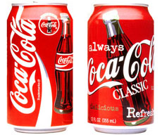
Figure 1: Past and Present: Coca-Cola's new brand image replaces the streamer pattern that has been used since 1969 with a familiar bottled image.
Figure 2: The big version of the new brand incorporates other nostalgic elements such as "aleays" and more descriptive words. The effect is to deliver a refreshing feeling to the customer while also pulling people's heart.
Figure 3: This new brand image was tried during the 96th Atlanta Olympic Games. In order to embody the idea of ​​the creation of the personality of the global brand by the Days Greppes & Cobb United Company, the advertising graphic positioned Coca-Cola as a beverage for sports fans.
Figure 4: During the 1998 World Cup, this image was further tested and extended. The pattern elements of the bottle are individually detached and simplified, and the bubble pattern reminds people of the nature of the drink.